
How to Choose the Perfect Grout Colour
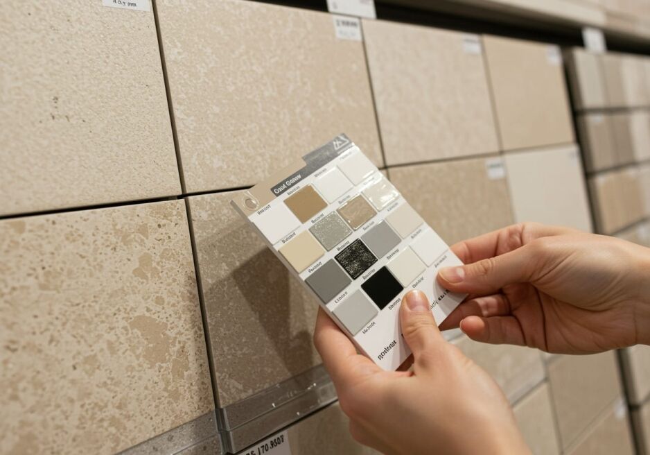
Choosing the right grout colour can make all the difference in your tile installation’s appearance and performance. Many homeowners face issues like mismatched tones, unsightly stains, or a design that doesn’t feel cohesive. If you’ve ever wondered why your tiles sometimes appear dull or how a simple change in grout could elevate your space, you’re in the right place.
This guide explains how to choose a grout colour that suits your tile, layout and room. I’ll cover blending and contrast, beige and cream tiles, white subway tiles, matching existing grout, maintenance and the Kemgrout options available from Ross’s. The aim is a finish that looks considered and remains practical for everyday use.
What are the Rules for Choosing Grout Colour?

A few simple checks make choosing grout colour much easier. Start with the tile itself, then consider the surrounding finishes, the pattern you want to show and how the area will be used.
Complement Your Tile
The grout should work with your tile rather than against it. Choose a grout shade that either closely matches your tiles for a uniform, seamless look or provides enough contrast to highlight the tile’s pattern and texture. This basic principle is one of the fundamental grout colour rules every designer follows.
Consider the Overall Colour Scheme
Your chosen grout colour should harmonise with the broader colour palette of your room. Whether you’re updating your bathroom or kitchen, think about how the grout interacts with walls, cabinetry, and other design elements. A well-coordinated colour scheme makes the entire space feel more cohesive.
Decide on Contrast or Blend
Determine whether you want your grout to blend in or stand out. Blending creates a smooth, continuous look, ideal for a minimalist design, while contrast can add visual interest and accentuate the layout. This decision should be driven by your personal style and the overall design goals of your project.
Factor in Maintenance and Durability
Maintenance matters, but colour affects what you notice rather than how clean the grout actually is. Light grout can show some stains sooner, while dark grout may better conceal dirt yet still show pale residue, soap film or uneven fading. Choose the look you want, then follow the product’s cleaning and sealing instructions.
Use Trends as a Reference, Not a Rule
Neutral grout colours remain easy to pair with many tiles, but a trend should not decide the job. A grout shade needs to work with the tile undertone, the room’s finishes and the amount of contrast you want. That combination will usually age better than a colour selected only because it is currently popular.
Following these design tips on grout selection will help you achieve a well-thought-out, durable, and aesthetically pleasing result. Whether you’re tackling a full renovation or a small update, these rules provide a solid foundation for making an informed choice on how to choose a grout colour that works for your space.
Should Grout be Lighter or Darker than the Tile?
Grout can be lighter, darker or close in colour to the tile. A close match creates a calmer, more continuous surface. A contrasting shade outlines every tile and makes the layout more prominent. Your choice should reflect the tile, room, joint consistency and the amount of visual detail you want.
Both have merits; the right choice depends on your design vision and lifestyle.
Advantages of Lighter Grout
- Creates a Seamless Look: Lighter grout can blend with light-coloured tiles and make the tiled surface look more continuous. This can help a compact room feel calmer, although grout colour alone will not determine how large the room appears.
- Keeps the Surface Light: A pale grout avoids adding dark lines across light tiles, which can suit bright bathrooms, kitchens and laundries.
- Potential Drawback: The downside is that lighter grout tends to show stains and dirt more readily, which may require more frequent cleaning.
Advantages of Darker Grout
- Adds Bold Contrast: Darker grout provides a striking contrast, highlighting the texture and pattern of your tiles. This can be particularly effective if you want a more traditional or industrial look.
- Conceals Some Marks: Darker shades may conceal some stains and everyday discolouration better than white grout. They can still show soap film, mineral residue and cleaning-product build-up.
- Consideration: However, if you’re going for a seamless, modern appearance, too much contrast might break up the visual flow of your tile layout.
Choosing Based on Your Design Style
Your grout colour choice should ultimately complement your overall tile design. For instance, many modern Australian bathrooms benefit from lighter grout to create a cohesive, spacious feel, while darker grout might be more suitable for kitchens or heritage-style homes where accentuating tile contrast is desired. Evaluate your space’s natural light, traffic levels, and your personal style to determine which option best aligns with your design goals.
By weighing these pros and cons, you can make a more informed decision on your grout colour choice, ensuring that your selection looks great and stands up to everyday life.
What Grout Colour Works Best With Beige or Cream Tiles?
Warm off-white, cream and beige grout usually create the most blended finish with beige or cream tiles. Greige or warm grey adds gentle definition, while mid-grey produces a stronger outline. The best choice shares the tile’s undertone and is checked beside the actual tile under the room’s lighting.
For a Soft, Blended Finish
Choose a warm off-white, cream or beige grout close to the tile’s base colour when you want the surface to read as one area. This approach suits tiles with gentle patterning because the grout does not compete with the variation through the tile. It can also keep a bathroom wall or kitchen splashback looking calm rather than divided into a strong grid.
For Gentle or Stronger Definition
Warm grey and greige grout can define each tile without creating a severe contrast. Mid-grey makes the layout more obvious and can work well when the tile shape or laying pattern is part of the design. Avoid choosing grey by name alone. Some greys have cool blue undertones that can sit awkwardly beside a warm cream tile.
Check the Undertone and Lighting
Beige tiles can lean yellow, pink, taupe or grey, so compare the grout against the tile face and any colour movement within it. I always check a grout sample beside both the lightest and darkest areas of the tile. View it in daylight and under the room’s lights because warm LEDs can make cream and greige shades look quite different. A small cured sample is safer than relying on a screen or colour name.
How to Match Grout Colour to Existing Grout?
The best way to match new grout to existing grout is to compare cured samples in the actual room. Clean the existing joint first, because dirt and age can change its appearance. Test the closest shades on a tile offcut or in an inconspicuous area, then compare them in daylight and artificial light. An exact match is not always possible with older grout, but this process helps you find the closest practical option.
If you’re still uncertain, bring a clean tile offcut or clear photos into our Guildford showroom. Callum has extensive experience helping customers compare grout shades and can help you identify the closest practical option.
Make a Sample Board
Apply the shortlisted grout colours between spare tiles and allow them to cure as directed. A sample board shows the finished colour beside the actual tile and lets you compare more than one option without testing across the completed installation.
Different Lighting Conditions
Grout colour can look different in daylight, warm artificial light and cool artificial light. Check the cured sample at several times of day and beside the surrounding cabinetry, paint and fittings.
These checks give you a much better chance of finding a close match. They also reveal whether a small colour difference will blend into the existing installation or remain noticeable across a larger repair.
What is the Most Popular Grout Colour?
Light grey, off-white and other neutral shades are among the grout colours we see customers choose most often. They work with a wide range of tiles and can create either a close match or gentle definition. Popularity is useful as a starting point, but the tile undertone and desired contrast should make the final decision.
Neutral Tones for a Seamless Look
Light grey and off-white grout can create a quiet backdrop that lets the tile colour and texture do the work. These shades are versatile, but neither is maintenance-free. The right neutral is the one that sits naturally with the tile and the rest of the room.
Contrasting Options for Bold Impact
On the other hand, some homeowners prefer a contrasting grout colour to highlight the intricate patterns of their tiles. A darker grout can provide that striking contrast, making the tile design pop, particularly in areas where you want to create a focal point. However, this style may suit more traditional or industrial designs rather than a seamless, modern aesthetic.
By considering these popular grout colour choices, you can make an informed decision on how to choose a grout colour that enhances your tile installation and meets your practical needs and design goals.
What Grout Colour Works Best With White Subway Tiles?
White, off-white, light grey, charcoal and black grout can all work with white subway tiles. White and off-white create the quietest finish. Grey adds definition, while charcoal or black makes every joint and pattern stand out. The best choice depends on the layout, room size, joint consistency and maintenance expectations.
Before deciding, compare the grout against the actual tile rather than a screen. You can also browse our current subway tile colours and finishes to see how the tile surface changes the finished combination.
White Grout: The Classic Choice
White grout blends closely with a white tile and keeps the wall looking simple. Off-white softens the result when the tile has a warm undertone or the surrounding finishes are cream, timber or warm white. This lower-contrast approach often suits a bathroom with white subway tiles where the aim is a clean surface rather than a strongly outlined pattern.
Pale grout can show discolouration sooner, especially around cooking areas and regularly used showers. That does not make it the wrong choice, but it means the cleaning routine and the grout manufacturer’s care advice need to suit the location.
Mid-Grey, Charcoal and Black Grout
Mid-grey, charcoal and black create progressively stronger contrast. They can make brick bond, stacked and herringbone layouts a major design feature. They also expose uneven joint widths and small alignment differences, so careful set-out and consistent installation become more important.
Let the Pattern, Joint and Room Decide
Contrasting grout draws attention to the layout, while a close match lets the tiles read as a broader surface. Our guide to subway tile patterns shows how brick bond, stacked and herringbone layouts change the effect. Strong contrast can make a small tiled area look busier, although it can also create a deliberate feature wall.
Dark grout is not maintenance-free. Soap film, mineral deposits, cleaning residue and uneven fading may be more visible against charcoal or black. The same contrast principle also works in reverse: pale grout outlines black subway tiles and makes the joint pattern more prominent.
I recommend checking a cured sample beside the tile under both natural and artificial light. Look at it from normal viewing distance, not just close up. That gives you a clearer sense of whether the grout supports the tile or becomes the first thing you notice.
Is Grey Grout Easier to Keep Clean?
Grey grout is not easier to clean simply because it is grey, but it may conceal some dirt and staining better than white or cream. It still collects grime and needs the same regular care required by the product and location. Grey can also show pale soap film, mineral deposits or cleaning residue, particularly in wet areas.
Here are some grout cleaning and maintenance tips to ensure your grout remains its original colour:
- Regular Cleaning: Use the cleaner and method recommended for the grout and tile. Remove residue before it builds up, and avoid harsh or abrasive products that may affect the surface or colour.
- Check Whether Sealing Is Required: Some cement-based grouts may need a compatible sealer, while other products have different care requirements. Follow the grout manufacturer’s instructions rather than sealing every grout installation automatically.
- Spot Cleaning: Clean spills and residues promptly so they have less time to settle into the joints.
- Choose for the Whole Job: Consider the tile, location, desired contrast and cleaning routine together. Grey is a practical option when it gives you the finish you want, not because it removes the need for maintenance.
A suitable product and a consistent cleaning routine matter more than choosing a colour purely to hide dirt.
Is Dark Grout Out of Style?
Dark grout is still a valid design choice. It creates strong contrast, defines the tile layout and can give a splashback or feature wall a graphic look. The result depends less on whether the colour is currently fashionable and more on how it works with the tile, room and surrounding finishes.
Here are a few points to consider when deciding how to choose a grout colour:
- Visual Impact: Dark grout highlights individual tiles and makes the laying pattern more obvious. It works particularly well where the tiled surface is intended to be a feature.
- Design Flexibility: Although many prefer lighter shades, modern designs still incorporate dark grout to add depth and drama, especially with white tiles or pastels. It’s all about balancing the overall look of your room.
- Practical Considerations: Check the lighting, room size and cleaning routine. Dark grout may conceal some stains, but it can show pale dust, soap film, mineral deposits and cleaning residue.
Dark grout is not outdated. Use it when the stronger outline supports the tile and the overall room, and make sure the installer can achieve consistent joints.
What Grout Do Professionals Use?

We regularly sell Kemgrout Coloured Grout to DIY renovators and professional tilers. Its broad colour range is useful because it gives customers more scope to match a tile or create deliberate contrast. The current range lists 20 colours in 2 kg and 10 kg bags, so check the live product options before ordering.
Key benefits of Kemgrout Coloured Grout include:
- Joint Width and Flexibility: Kemgrout is suitable for joints up to 5 mm and is polymer fortified to reduce the likelihood of cracking.
- Wet-Area Features: The product is mould resistant and water repellent, making it suitable for wall and floor applications where its specifications match the job.
- Colour Performance: Kemgrout is formulated for strong, uniform colour and reduced efflorescence. Always mix and apply it according to the current product instructions.
- Practical Choice: The available colours cover pale neutrals, greys, earthy shades and stronger accent colours, which helps customers compare options against the actual tile.
Kemgrout is one product option rather than a universal answer for every installation. Confirm the joint width, substrate, location and current manufacturer instructions before use.
Frequently Asked Questions About Grout Colour
Conclusion
Choosing the perfect grout colour means balancing appearance with practical care. Compare the grout with the actual tile, decide whether you want the joints to blend or stand out, and check the cured colour under the room’s lighting before you commit.
Here’s a quick recap of our grout colour tips:
- Complement and Contrast: Whether you prefer a subtle, seamless look or a bold accent, matching or contrasting your grout with your tiles can dramatically change the room’s feel.
- Maintenance Matters: Light and dark grout can show different types of marks. Choose the finish you want, then follow the product’s cleaning and sealing instructions.
- Long-Term Appeal: Neutral shades are versatile, while dark grout can create a strong feature. Select the option that works with the tile and surrounding finishes rather than relying on a short-term trend.
- Product Choice: Kemgrout offers a broad colour range plus mould resistance, water repellence and strong, uniform colour. Confirm that its current specifications suit the installation.
Compare your tile with the Kemgrout colour options online or bring a tile offcut into our Guildford showroom. You can also browse our tile adhesives and grout for the products needed to complete your tiling project.
