
Feature Tiles: How to Choose, Place and Use Them Without Overdoing It
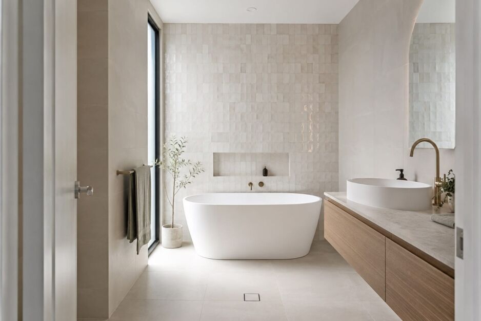
The tile that stops you in the showroom, the zellige, the marble-look slab, the mosaic with the glaze variation you can’t quite replicate, is usually not the problem. The problem is what happens next. I see it regularly: a customer walks in with a tile they’ve already fallen in love with, sometimes already purchased, and they have no clear picture of which wall it goes on, how much of it to use, or whether it will hold up against their floor tile without the whole room looking like it’s fighting itself.
A feature tile is a tile chosen for its visual impact rather than its surface coverage. It creates a focal point in a room, on one wall, in a niche, or across a splashback, and is typically used in smaller quantities than the field tiles, porcelain tiles, or ceramic tiles surrounding it. Mosaic tiles and zellige tiles are among the most common types used in Perth homes.
This guide covers the rules that make feature tiles work: how to choose feature wall tiles, where to place them, how many to use, how to coordinate them with floor and wall tiles, and how to use feature tiles for bathrooms, kitchens, laundries and living areas. If you’re ready to browse now, our feature tiles range is a good place to start.
What Makes a Tile a Feature Tile?
The term gets used loosely in Australian renovations. It can mean a subway tile splashback in a kitchen, a mosaic shower niche in an ensuite, or a large-format stone-look wall tile running floor to ceiling behind a freestanding bath. What connects all of them is intent. A feature tile is chosen to draw the eye. A field tile, the base tile covering the majority of a surface, is chosen to do everything else.
The distinction is worth understanding clearly before you buy anything.
Field tiles are the workhorses. They are typically neutral, plain, and low in texture. They cover most of the room. A feature tile, sometimes called a hero tile, sits against that quiet background and earns the attention. An accent tile is narrower again, a border strip, a trim piece, or a single contrasting row. It adds detail without committing to a full feature surface.
The tile types that appear most often in this role are large-format stone-look tiles, marble-look tiles, travertine-look tiles, mosaic tiles, kit kat tiles, zellige-look tiles, encaustic-look tiles, and timber-look tiles. If you want to see which of these are gaining the most ground in Perth right now, our 2026 tile trends guide covers the current direction across all tile categories.
Each one works differently in different rooms, which is where the real decisions begin. Choosing the tile is only half the job. Knowing where to put it, and how many to use, is where most homeowners get stuck.
Where to Place Feature Wall Tiles (and Where Not To)

Placement is what separates a feature tile that looks intentional from one that looks like an afterthought. The feature wall should command attention from the room’s main viewing position. In most bathrooms, kitchens and living areas, that means choosing a wall visible as you enter. If the layout has a stronger focal point behind a vanity, bath, cooktop or fireplace, follow that sightline instead.
Choosing the Right Feature Wall
The focal point wall is the one the eye moves to first when entering a room. That is the wall that earns the feature tile. In a bathroom, it is typically the wall directly opposite the door, the wall behind the vanity, or the wall behind a freestanding bath. In kitchens, it is almost always the splashback wall behind the cooktop, the surface that anchors the whole room visually from the main living zone. In a living area, it is the wall behind the main seating arrangement or fireplace.
Three placement mistakes are worth naming specifically, because they come up often enough that they are worth avoiding by name.
- Do not feature-tile a side wall that runs parallel to the entry. A wall seen only from a narrow angle loses most of its impact. The tile is doing all the work for an audience that can barely see it.
- Do not rely on a shower or bath niche as your feature surface. A niche filled with shampoo and soap is a storage space, not a focal point. A mosaic or zellige-look tile looks excellent in a niche as a detail, but it should not be the only feature tile moment in the room.
- Do not feature-tile two opposing walls. When two walls compete for the eye’s attention, neither wins. The room feels busy, and the tile loses its impact entirely.
For readers choosing feature tiles for a wall application, including a feature wall tile, our practical guide covers suitability, finish, size and installation. Read how to choose wall tiles for different applications before you shortlist the exact product.
Floor vs Wall — Where Feature Tiles Work Hardest
Feature Wall Tiles vs Feature Floor Tiles
Most people use feature tiles on walls, and for good reason. Many decorative feature tiles, including a glossy mosaic, a zellige-look ceramic and a large-format marble-look porcelain, may not be approved for floor use.
AS 4586 classifies the slip resistance of new pedestrian surface materials, including Wet Pendulum Test ratings from P0 to P5. These ratings apply to floors people walk on, not feature walls. There is no single P rating that suits every bathroom or outdoor location, so confirm the required slip performance for the exact surface and conditions.
AS 3958.1 provides guidance on ceramic and stone tile installation, including substrates, preparation, fixing and grouting. It should not be treated as a universal tile-selection rule.
Feature tiles on floors do work well in three specific situations: a dry living area where an encaustic-look porcelain creates a centrepiece underfoot, a hallway entry used as a statement floor, and an outdoor entertaining area where the tile carries the required slip rating for the conditions.
For Perth homes, an outdoor feature tile must be approved by its manufacturer for the exact location and exposure. Check floor suitability, slip resistance, water absorption and any stated limits for UV, heat or weather exposure.
Porcelain generally has low water absorption, but that figure alone does not confirm outdoor suitability or prevent heat- or UV-related damage. Indoor-outdoor tiling through a sliding or stacking door is a common renovation choice, but the tile must be specified correctly for both sides of the threshold.
How Many Feature Tiles Should You Use?
The most common feature tile mistake is not choosing the wrong tile. It’s using the tile on too many surfaces. One feature wall changes a room. Two feature walls compete for attention. Three feature walls create visual chaos.
I had a customer come in a couple of years ago who had already tiled three walls of her ensuite in a heavily veined marble-look porcelain. It was a beautiful tile. On one wall, it would have been striking. Across three walls of a standard Perth ensuite, the veining had nowhere to rest, and the room felt like it was closing in. She was asking whether regrouting would help. It would not. The tile was the right choice in the wrong quantity. That conversation is the reason I now talk about quantity rules before we get anywhere near product selection.
The practical framework for choosing feature tiles comes down to four design rules that hold across rooms and tile types.
- One featured surface per room. One wall, one splashback, or one floor zone. Not two. The moment a second surface gets the feature tile treatment, the first one loses its impact. The eye needs a place to settle.
- Keep feature tiles to roughly 20–25% of the total tiled surface area. That is my practical design rule. In most rooms, it means one complete feature wall, one splashback or one smaller feature zone, not several competing surfaces. A niche may use far less, while a generous room may support a full floor-to-ceiling feature wall. The principle remains the same: give the feature tile enough quiet field tile around it to stand out.
- Scale carries visual weight. A large-format 600x600mm stone-look tile used as a feature wall reads as heavier than a small mosaic across the same area. The larger and bolder the tile, the less of it you need. A full-height large-format feature wall in a generous Perth bathroom can be a single surface. Nothing else needs to compete.
- Bold tile, quiet room. If the tile has strong colour, pattern, or texture, every other surface in the room should be plain, neutral, and low in contrast. The tile earns its place by being the only element asking for attention.
How to Choose Feature Wall Tiles: Coordinating Floors and Walls
Style and Colour: Matching the Room
Start with the room’s design style and colour palette, then choose a feature wall tile that supports them. Look for a shared warm or cool undertone across the tile, floor, benchtop, cabinetry and fittings. The feature can be bold, but it should still belong to the same room.
The feature tile does not need to match the floor tile. It needs to coordinate with it. Matching may mean using the same tile family in another format. Coordinating can mean sharing an undertone, finish or scale without being identical. Field tiles should sit quietly behind the feature tile rather than compete with it.
Matte vs Gloss — Getting the Finish Right
Finish coordination is one of the most reliable ways to make a tile feature wall read as considered rather than accidental. The table below covers the pairings that work and the ones that do not.
| Finish Pairing | Does It Work? |
| Matte feature tile + matte floor tile | Yes. Consistent finish temperature, calm and cohesive. Works especially well in warm neutral schemes. |
| Gloss feature tile + matte floor tile | Yes. Classic contrast. The gloss wall tile reflects light upward; the matte floor tile grounds the space. Both should share the same warmth temperature. |
| Matte feature tile + gloss floor tile | Yes, with caution. Works if the tones are closely related. Avoid pairing a warm matte tile with a cool gloss floor tile, or vice versa. |
| Gloss feature tile + gloss floor tile | Avoid in most cases. Too much surface reflection in a standard room. Can work in large, light-filled spaces where glare is controlled. |
| Textured / 3D feature tile + smooth floor tile | Yes. Texture on the wall, smoothness on the floor is a reliable pairing. The floor grounds the room and the feature wall provides depth. |
The finish coordination rule that overrides everything else: warm tones pair with warm tones, cool tones with cool. A warm travertine-look matte feature tile paired with a cool grey gloss floor tile will read as a mismatch regardless of the finish combination. Get the warmth temperature right first, then sort the finish pairing.
Choosing Grout Colour for Feature Tiles
Grout colour is one of the most overlooked finish coordination decisions and one of the most visible once it goes wrong. For textured, patterned and decorative feature tiles, tonal grout is usually the right choice. It lets the colour, glaze and surface variation lead instead of turning the grout grid into the dominant feature.
Use contrasting grout when the grid is deliberately part of the design, such as a plain subway tile in a stack bond layout. If the tile already has strong texture or pattern, keep the grout quiet. Test the pairing on a sample board because the same grout colour can read differently beside different glazes and finishes.
Choosing Feature Tile Sizes and Formats
The feature tile and the floor tile do not need to be the same size. They do need a clear relationship. A large-format feature tile paired with a small mosaic floor can work, but both surfaces carry strong visual weight. If the colour, pattern and grout lines are also busy, simplify either the feature or the floor tile.
Three scale guidelines work across most rooms.
- Pair small-format feature tiles, including mosaic, kit kat and zellige-look tiles, with quieter floor tiles such as 300x600mm or 600x600mm formats. The larger floor format reduces grout lines and gives the feature wall visual breathing room.
- Large-format feature tiles, including 600x1200mm panels and slab-look applications, often pair well with 600x600mm or larger floor tiles. A smaller mosaic floor can still work, but keep its colour and pattern restrained when the feature wall already carries strong visual weight.
- When the floor and feature tile come from the same range, the same stone-look family in different formats, for example, the finish coordination almost always resolves itself.
Feature Tiles by Room: Bathrooms, Kitchens, Laundries and Living Areas
The rules above apply in every room, but the specific applications vary. What works behind a bathroom vanity is different from what works above a kitchen cooktop or in a Perth alfresco-adjacent living area.
Here is how to think about using feature tiles in each context.
Feature Tiles for Bathrooms
Bathrooms are where Perth renovators get this decision right most often, and wrong most often. The classic placements are the wall directly opposite the entry, the wall behind the vanity, the wall behind a freestanding bath, and the full rear wall of a shower recess. All four work. The mistake is using more than one of them in the same room.
The most common version of this I see in Perth ensuites: a bold zellige-look ceramic on the vanity wall and a large-format marble-look porcelain on the shower rear wall. Both tiles are strong choices individually. Together, they pull the eye in two directions and neither gets to do its job. Pick the focal point that suits the layout and commit to it.
Tile types that work hardest in bathroom feature applications include zellige-look ceramic on a vanity wall, mosaic tiles in a shower niche, large-format stone-look or marble-look porcelain on a full vanity feature wall, and kit kat tiles as a textured vertical column.
When comparing bathroom feature tiles, feature tiles for bathrooms or feature shower wall tiles, decide which single surface should lead the room. For guidance on the surrounding bathroom tiles, read our guide to choosing the best tiles for bathroom walls.
For a shower feature wall, tiles and grout are surface finishes. They do not replace the waterproofing system required behind the tiled wet area. Your tiler should confirm the substrate, waterproofing, adhesive, movement joints and installation method as one compatible system before work starts.
Feature Tiles for Kitchen Splashbacks
In kitchens, the feature tile is almost always the splashback. The splashback wall from benchtop to rangehood is the natural feature surface in a kitchen. In most Perth open-plan homes, it is visible from the main living and dining zone, which makes it the highest-impact tiling decision in the room.
The strongest direction for tiles in 2026 kitchen designs is textured. Zellige-look ceramic, fluted glass, and handmade-look ceramic in warm whites, sage, or terracotta all add depth through surface variation rather than colour or pattern. Patterned splashback tiles still work, but keep them to one surface. A patterned splashback alongside a patterned island bench tile, and a patterned floor are three surfaces competing for attention at once. For the broader picture on what is moving in Perth kitchen splashbacks this year, our 2026 kitchen splashback trends guide covers it in full.
One practical note for Perth kitchens: a feature tile directly behind a cooktop must be suitable for that location and installed to the appliance manufacturer’s clearance and wall-finish requirements. Do not assume every ceramic, porcelain, terracotta or unglazed tile is suitable based on material alone.
Check the product information with your supplier and tiler. Browse our splashback tiles range for options intended for kitchen use.
Feature Wall Tiles for Living Areas
Most Perth homeowners stop at the bathroom and kitchen when they think about feature tiles. The living area is worth reconsidering. A feature wall behind the main seating area or fireplace, or a statement entry floor, are the two placements worth considering.
For living area feature walls, large-format stone-look or concrete-look porcelain in a floor-to-ceiling application reads as architectural rather than decorative. It works particularly well in Perth homes with high ceilings and strong natural light. The tile stops being a decoration and becomes part of the room’s structure.
For entry floors, encaustic-look porcelain or patterned floor tiles confined to the entry zone create a clear boundary between entry and living area without needing a different floor material. The feature floor tile should stay in the entry. Once it enters the main living area, the definition that makes it work disappears.
In Perth homes that open to an alfresco through sliding doors, continuing one tile design from inside to outside can visually erase the boundary between the two spaces. The exact product must be approved for both locations.
Check floor suitability, slip resistance, water absorption, UV exposure and the installation requirements on each side of the threshold. Porcelain tiles are often considered for this application, but material alone does not make every porcelain tile suitable outdoors.
Feature Tiles for Laundry Splashbacks
Laundries are low priority for feature tiling but worth covering, especially for high-end homes. A laundry splashback is the most common application. Keep it simple: a textured ceramic in a single colour, a small mosaic section, or a plain subway tile with a coloured grout.
The laundry is a working space. The tile should add a moment of personality without creating a maintenance obligation it will never receive.
Feature Tile Costs and Budget
At Ross’s, many feature tiles are sold individually, while mosaic tiles are commonly sold by the sheet. Individually priced feature tiles generally range from about $5 to $80 per tile. Some ranges are sold by the square metre instead. Our encaustic-look tiles, for example, are around $60 per square metre.
The unit price does not tell you what the finished feature will cost because tile and mosaic-sheet sizes vary. Work out how many tiles or sheets cover the chosen wall, splashback or niche, then compare the total tile cost. Also allow for trims, extra cuts, pattern matching and any specialist adhesive or substrate preparation required for the installation.
I have used this approach in my own renovations: spend the design budget on the focal surface, then use a simpler field tile across the larger areas. It gives the feature tile room to stand out and can keep the overall tile budget under control.
Measure the feature area with your tiler before ordering and include the agreed allowance for cuts, pattern matching and breakage. This matters most with batch-sensitive finishes, because buying another box later may introduce a visible change in tone or glaze.
Common Feature Tile Mistakes to Avoid
Knowing how to use feature tiles well is as much about avoiding the common errors as it is about getting the placement right. Most regrets come down to the same handful of mistakes, and they are avoidable once you know what to look for.
- Choosing the tile before choosing the room and wall. The tile should be chosen to suit the room’s dimensions, natural light, and existing materials. A heavily veined marble-look tile that looks stunning on a sample board can overwhelm a narrow Perth ensuite with limited natural light. Start with the wall, then find the tile that suits it.
- Using contrast grout on a textured feature tile. Tonal grout is almost always the right choice for a textured, patterned, or decorative feature tile. Contrast grout draws the eye to the grout grid rather than the tile surface. On zellige or mosaic, it works against the inherent texture the tile was chosen for.
- Ignoring surface suitability for wet-area or outdoor use. Decorative tiles are not automatically approved for floors, wet areas or outdoor exposure. Check floor suitability and the required slip resistance before specifying a feature tile for a shower floor, bathroom floor or outdoor alfresco. A bath surround or shower wall needs wall and wet-area suitability, not a pedestrian slip rating. If the product information is unclear, ask before buying.
- Skipping a large-format sample test in the actual room. A 200x200mm sample on a white showroom board looks very different from the same tile across two square metres of wall in a Perth bathroom under mixed daylight. Ask for a larger sample or a sample board loan before committing. We offer both at Ross’s, and it has saved more than a few customers from a decision they would have regretted.
- Buying to the exact square metreage. Tiles with natural variation, zellige, handmade-look ceramic and similar finishes can differ subtly in tone and glaze between production batches. A 10% allowance is a common starting point, but cuts, pattern matching, breakage and the layout can require more. Ask your tiler to confirm the quantity before ordering. A discontinued tile or a broken piece mid-installation can be difficult to match from another batch.
Frequently Asked Questions
Choosing the Right Feature Tiles
One main feature surface per room, finish coordination by warm or cool undertone, and the right tile specified for the right application. Those three principles cover most of what separates a feature tile decision that works from one that needs to be redone.
The part that is harder to get right from a screen is how a tile actually reads at scale, in a real room, under real light. A sample on a white board in a photograph tells you the colour. It does not tell you the visual weight, the texture under light, or how it reads against the floor tile you are already committed to. For feature tiles Perth homeowners are serious about, coming into the Guildford showroom to compare full-format samples in context makes the decision considerably more straightforward. We can show you tiles alongside each other rather than in isolation, which is where the coordination questions tend to answer themselves.
Browse our feature tiles range to see what is available across porcelain, ceramic, mosaic, and stone-look options, or come and see us at 57 James Street, Guildford, and we will help you work through the selection in person.
